Picture a potential customer walking up to your restaurant or browsing your menu online for the first time. Within seconds, they’ve already formed an opinion about your business – often based on design cues alone. In fact, 75% of consumers admit to making judgments on a company’s credibility based solely on its website design. If your restaurant’s branding and materials look unprofessional or outdated, that first impression could be driving diners away before they even taste your food. Poor design isn’t just an aesthetic issue; it has real impacts on customer behavior and, ultimately, your bottom line. From hard-to-read menus and lackluster flyers to sloppy social media posts, subpar design elements signal to customers that your restaurant might not deliver a quality experience. In this article, we’ll break down how common design mistakes – in menus, print collateral, and online visuals – are costing you customers and revenue. We’ll also look at real before-and-after examples of restaurant rebrands that turned things around and wrap up with actionable steps you can take to ensure your design draws customers in rather than drives them away.
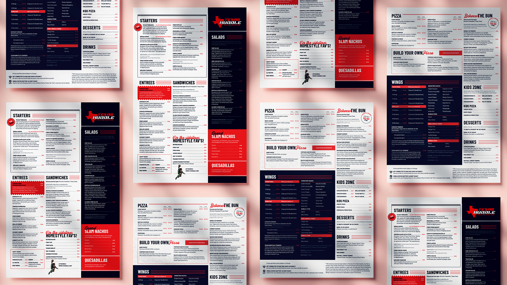
Your menu is often called the “silent salesperson” of your restaurant – it communicates your offerings, influences what customers order, and even how much they spend. A well-designed menu can entice guests to explore and purchase more, whereas a poorly designed one can cause confusion or discourage spending. Research backs this up: In general, a good menu results in higher sales and happy customers, while a bad one leads to low profits and unhappy diners. If your menu is cluttered with too many items, hard-to-read fonts, or lack of visual hierarchy, customers might skim past high-profit dishes or feel overwhelmed and stick to the same safe choice (or worse, decide to eat elsewhere).
Consider pricing design as one example. Something as simple as menu typography can impact spending. A Cornell University study found that diners spent about 8% more when menus omitted dollar signs from prices. This subtle design tweak makes prices feel less like “real money,” encouraging guests to order that appetizer or extra drink. Now imagine the lost potential if your overall menu design is poor – confusing layouts, no photos or too many low-quality photos, and chaotic descriptions can all reduce how much a guest orders. On the other hand, strategic design choices like highlighting signature dishes, using mouth-watering imagery, and grouping items logically guide customers toward profitable menu items. The goal is a menu that’s both attractive and easy to navigate, so it upsells for you. If your current menu is doing the opposite, it’s likely costing you sales you didn’t even realize you were missing.
By treating your menu as a critical design project – investing in professional layout, appetizing visuals, and strategic item placement – you turn it into a powerful tool for increasing customer satisfaction and check sizes, rather than a liability.
Your restaurant’s “design” isn’t just the menu. It extends to all printed and physical materials that a customer encounters: your logo, signage, flyers, table tents, business cards, and even the look of your takeout menus or mailers. These elements collectively shape the first impression of your brand. If your flyers are cluttered or your logo looks amateur, customers may assume those flaws reflect the overall dining experience. As one design expert notes, a weak visual presentation at the front door – such as an outdated or uninviting sign – can cause “potential customers to turn away before even stepping inside.” In other words, poor design in your branding and print collateral can literally stop foot traffic cold.
A professionally designed event poster for a restaurant, with a clear theme and attractive visuals. In a rebrand, high-quality print collateral like this can replace dull or confusing flyers, making a striking first impression on customers.
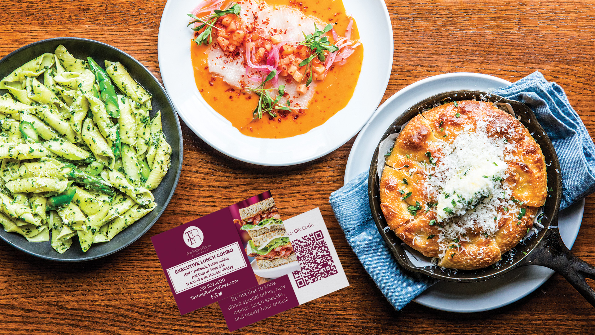
Think about the printed promotions you use. Are your flyers and table signs eye-catching and on-brand, or do they feature blurry photos and mismatched fonts? In the age of social media and design-savvy consumers, people notice these details. An unpolished flyer might get tossed in the trash, whereas a well-designed one can pique interest. For example, a multi-location wine bistro called The Tasting Room discovered the power of upgrading its print collateral. They introduced new, vibrant in-store promotional materials (like elegantly designed table cards advertising a lunch combo and special events) as part of a brand revamp. The result? The restaurant saw a 55% increase in midday foot traffic once these attractive lunch special promos and consistent branding were in place. By clearly advertising specials with a visually appealing design, they turned previously slow lunch hours into revenue opportunities.
Brand consistency is key here. All your print materials – from business cards to posters – should have a unified look that reinforces your restaurant’s identity. One steakhouse startup, Facón Brazilian Steakhouse, invested in comprehensive brand development before its grand opening, ensuring everything from the logo to the menus and signage told a cohesive story. This paid off immensely. By debuting with a polished, professional brand image, Facón quickly captured local diners’ attention and loyalty. In its first year, Facón generated $3 million in revenue (far exceeding expectations) and grabbed ~40% market share in its area. The strong design of its print collateral (grand opening invitations, banners, VIP guest cards, etc.) made the restaurant memorable and enticing, directly contributing to that success.
The lesson: Don’t skimp on branding and print design. Modern consumers are visual; they equate the quality of your marketing materials with the quality of your food and service. An investment in better design – a professionally designed logo, attractive menus and flyers, well-placed signage – builds credibility and excitement. On the flip side, inconsistent or poor-quality print materials erode trust and interest, costing you potential customers who walk right past your door.
In today’s digital world, many customers “meet” your restaurant online before they ever visit in person. Your website (and online ordering pages) are essentially a digital front door. A poorly designed, outdated, or confusing website can drive away hungry visitors in seconds. Consider that 38% of people will stop engaging with a website if the content or layout is unattractive. If a user lands on your restaurant’s site and encounters clashing colors, hard-to-read text, or missing information, there’s a good chance they’ll click away and decide on a different eatery. Even worse, if your site doesn’t load quickly or isn’t mobile-friendly, you might be losing impatient would-be customers – 88% of online consumers are less likely to return to a site after a bad experience.
For restaurants, key website design pitfalls include: lack of mouth-watering food photos, not highlighting your best dishes or specials, cumbersome navigation (e.g. buried menu PDFs or broken links), and an overall look that doesn’t reflect your brand vibe (a cozy café shouldn’t have a sterile, generic site). It’s also crucial that your branding carries over online – the logo, color scheme, and tone from your physical venue should match what people see on your site for a coherent experience. Disjointed or sloppy web design not only confuses customers but also damages your credibility as a professional business. On the other hand, an attractive, user-friendly site can hook customers from the get-go.
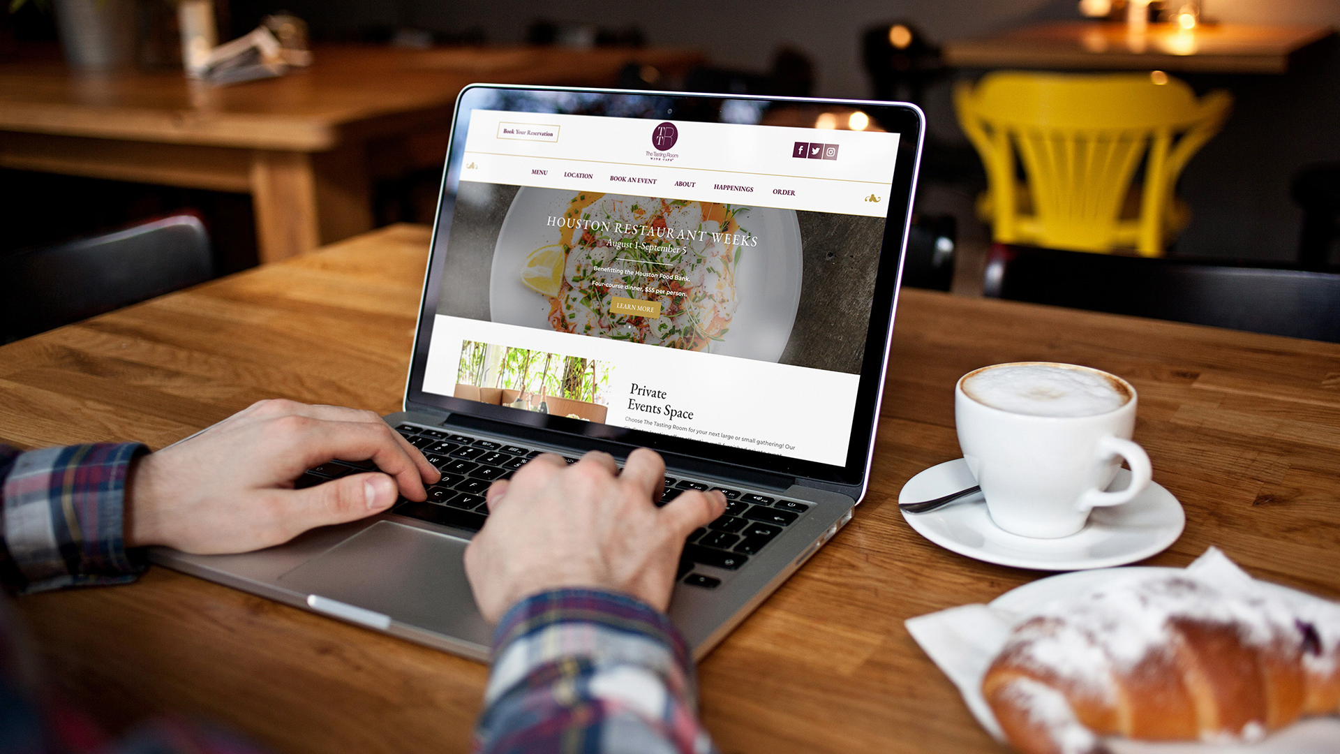
One case in point: The Tasting Room revamped its website as part of its design overhaul. The new site was visually appealing and showcased wine offerings and events clearly, which helped convert curious web visitors into actual guests. After launch, the restaurant saw online reservations jump by 30% thanks to effective digital advertising driving people to that well-designed site. For a brand-new concept like Facón Steakhouse, having a strong web presence was equally vital. By designing an elegant, mobile-responsive website ahead of its opening, Facón garnered 16,000 website visits in the first month, translating that online interest into fully booked tables (averaging 1,000 reservations per week). These examples show how good web design and branding can directly fuel customer traffic.
The takeaway here is simple: your website’s design can either be a customer magnet or a customer repellant. Make sure yours loads fast, looks great on a phone, and makes it effortless for visitors to find key info (menu, location, hours, reservations). Use enticing imagery and keep the design on-brand. If your site hasn’t been updated in years and feels like a relic, a refresh is overdue – it could be the difference between a customer choosing you or bouncing to a competitor. In many cases, your online experience is the first “taste” a customer gets of your restaurant, so it needs to be a good one.
Social media is now one of the top ways diners discover new restaurants and decide whether to give them a try. Platforms like Instagram, Facebook, and TikTok put your food and brand visuals front and center. This is a huge opportunity – 58% of consumers first discover new businesses on social media – but only if your posts catch their eye in a positive way. Poor design on social media (blurry photos, inconsistent graphics, haphazard branding) can silently cost you countless customers who scroll right past your posts. On the flip side, strong visuals can stop the scroll and spark engagement. In fact, posts with visual content receive 10 times more engagement than text-only posts, underscoring how crucial compelling design is on these platforms.
If your restaurant’s Instagram feed is a random mishmash of poorly lit food pics one day, a stretched logo graphic the next, and off-brand meme content after that, people will struggle to get a sense of your quality. They might even doubt how serious you are about your business. Consistency and professionalism matter on social media. Branding your posts with a cohesive style (colors, fonts, voice) helps build recognition over time. For example, when The Tasting Room improved the quality and consistency of its social media content – featuring beautiful wine photography, well-designed announcements for events, and a coherent brand voice – the engagement from the community skyrocketed by 210%. That means more likes, comments, shares, and ultimately more people heading in to try the experience they saw online.
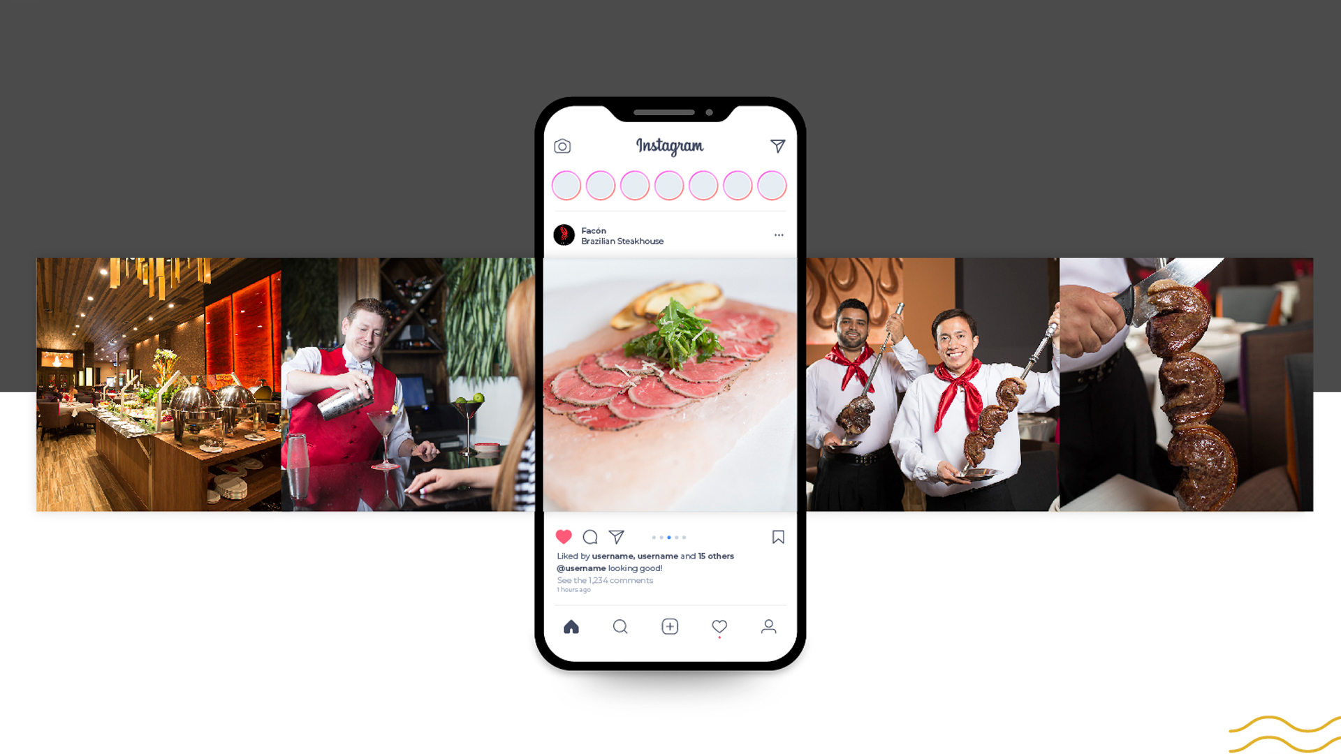
Another aspect is social proof. If your social media looks appealing and active, new customers are more likely to trust you. They see others interacting and delicious food being shown off. But if your last post was months ago or your images look unappetizing, potential guests may hesitate. One Brazilian steakhouse noted earlier, Facón, leveraged high-quality social visuals (professional photos of sizzling steaks, stylish graphics for promotions) and grew an online following of over 10,000 in its first year. That social buzz translated into real diners through the door. Engaging visuals are essentially free advertising – each share or re-post by a follower exposes your restaurant to new eyes. Thus, bad design on social media isn’t just a neutral absence of good; it’s a loss of what could have been: lost reach, lost engagement, and lost customers who never hear about you.
In summary, treat your social media pages as an extension of your brand experience. Invest time (or hire expertise) to produce high-quality photos of your dishes, design your flyers or announcements with the same care you would for print, and maintain a consistent look. Avoid common pitfalls like flyers full of text posted as images (nobody will zoom in to read), or using ten different font styles across your posts. Every social post is an opportunity either to impress someone or to lose their interest – make sure your design tilts toward the former.
Great food and service are the heart of any restaurant, but how you present them through design can determine whether customers ever give your food a chance. As we’ve seen, poor design – in menus, branding, or online – can silently sap your restaurant’s potential by undermining trust, reducing engagement, and making your offerings less appealing than they truly are. The upside is that improving your design and branding can quickly turn things around. The case studies above show that restaurants which invested in better design not only attracted more customers but also enjoyed significant boosts in sales and loyalty. It’s clear that good design is not a luxury for restaurants; it’s a necessity for standing out in a crowded market and retaining today’s visually driven consumers.
Before you panic or rush to redesign everything, here are some key action items to take away and implement:
By tackling the above steps, you’ll start turning what might be a design weakness into a strength. Remember, every element that a customer lays eyes on – whether a menu in their hands or an Instagram post in their feed – is an opportunity to convey your restaurant’s value and invite them in. Don’t let bad design cost you any more customers. With thoughtful improvements and consistency, your restaurant’s design will begin to win you customers instead of losing them, helping your business thrive for the long term.

We’re thrilled to have you at Design Hiro, branding is about more than a logo—it’s creating an experience that keeps guests coming back. Whether you’re launching or refining your brand, we’re here to help you stand out and build lasting loyalty. Let’s make your brand unforgettable!
SCHEDULE A CALL TODAY!Picture a potential customer walking up to your restaurant or browsing your menu online for the first time. Within seconds, they’ve already formed an opinion about your business – often based on design cues alone. In fact, 75% of consumers admit to making judgments on a company’s credibility based solely on its website design. If your restaurant’s branding and materials look unprofessional or outdated, that first impression could be driving diners away before they even taste your food. Poor design isn’t just an aesthetic issue; it has real impacts on customer behavior and, ultimately, your bottom line. From hard-to-read menus and lackluster flyers to sloppy social media posts, subpar design elements signal to customers that your restaurant might not deliver a quality experience. In this article, we’ll break down how common design mistakes – in menus, print collateral, and online visuals – are costing you customers and revenue. We’ll also look at real before-and-after examples of restaurant rebrands that turned things around and wrap up with actionable steps you can take to ensure your design draws customers in rather than drives them away.
Your menu is often called the “silent salesperson” of your restaurant – it communicates your offerings, influences what customers order, and even how much they spend. A well-designed menu can entice guests to explore and purchase more, whereas a poorly designed one can cause confusion or discourage spending. Research backs this up: In general, a good menu results in higher sales and happy customers, while a bad one leads to low profits and unhappy diners. If your menu is cluttered with too many items, hard-to-read fonts, or lack of visual hierarchy, customers might skim past high-profit dishes or feel overwhelmed and stick to the same safe choice (or worse, decide to eat elsewhere).
Consider pricing design as one example. Something as simple as menu typography can impact spending. A Cornell University study found that diners spent about 8% more when menus omitted dollar signs from prices. This subtle design tweak makes prices feel less like “real money,” encouraging guests to order that appetizer or extra drink. Now imagine the lost potential if your overall menu design is poor – confusing layouts, no photos or too many low-quality photos, and chaotic descriptions can all reduce how much a guest orders. On the other hand, strategic design choices like highlighting signature dishes, using mouth-watering imagery, and grouping items logically guide customers toward profitable menu items. The goal is a menu that’s both attractive and easy to navigate, so it upsells for you. If your current menu is doing the opposite, it’s likely costing you sales you didn’t even realize you were missing.
By treating your menu as a critical design project – investing in professional layout, appetizing visuals, and strategic item placement – you turn it into a powerful tool for increasing customer satisfaction and check sizes, rather than a liability.
Your restaurant’s “design” isn’t just the menu. It extends to all printed and physical materials that a customer encounters: your logo, signage, flyers, table tents, business cards, and even the look of your takeout menus or mailers. These elements collectively shape the first impression of your brand. If your flyers are cluttered or your logo looks amateur, customers may assume those flaws reflect the overall dining experience. As one design expert notes, a weak visual presentation at the front door – such as an outdated or uninviting sign – can cause “potential customers to turn away before even stepping inside.” In other words, poor design in your branding and print collateral can literally stop foot traffic cold.
A professionally designed event poster for a restaurant, with a clear theme and attractive visuals. In a rebrand, high-quality print collateral like this can replace dull or confusing flyers, making a striking first impression on customers.
Think about the printed promotions you use. Are your flyers and table signs eye-catching and on-brand, or do they feature blurry photos and mismatched fonts? In the age of social media and design-savvy consumers, people notice these details. An unpolished flyer might get tossed in the trash, whereas a well-designed one can pique interest. For example, a multi-location wine bistro called The Tasting Room discovered the power of upgrading its print collateral. They introduced new, vibrant in-store promotional materials (like elegantly designed table cards advertising a lunch combo and special events) as part of a brand revamp. The result? The restaurant saw a 55% increase in midday foot traffic once these attractive lunch special promos and consistent branding were in place. By clearly advertising specials with a visually appealing design, they turned previously slow lunch hours into revenue opportunities.
Brand consistency is key here. All your print materials – from business cards to posters – should have a unified look that reinforces your restaurant’s identity. One steakhouse startup, Facón Brazilian Steakhouse, invested in comprehensive brand development before its grand opening, ensuring everything from the logo to the menus and signage told a cohesive story. This paid off immensely. By debuting with a polished, professional brand image, Facón quickly captured local diners’ attention and loyalty. In its first year, Facón generated $3 million in revenue (far exceeding expectations) and grabbed ~40% market share in its area. The strong design of its print collateral (grand opening invitations, banners, VIP guest cards, etc.) made the restaurant memorable and enticing, directly contributing to that success.
The lesson: Don’t skimp on branding and print design. Modern consumers are visual; they equate the quality of your marketing materials with the quality of your food and service. An investment in better design – a professionally designed logo, attractive menus and flyers, well-placed signage – builds credibility and excitement. On the flip side, inconsistent or poor-quality print materials erode trust and interest, costing you potential customers who walk right past your door.
In today’s digital world, many customers “meet” your restaurant online before they ever visit in person. Your website (and online ordering pages) are essentially a digital front door. A poorly designed, outdated, or confusing website can drive away hungry visitors in seconds. Consider that 38% of people will stop engaging with a website if the content or layout is unattractive. If a user lands on your restaurant’s site and encounters clashing colors, hard-to-read text, or missing information, there’s a good chance they’ll click away and decide on a different eatery. Even worse, if your site doesn’t load quickly or isn’t mobile-friendly, you might be losing impatient would-be customers – 88% of online consumers are less likely to return to a site after a bad experience.
For restaurants, key website design pitfalls include: lack of mouth-watering food photos, not highlighting your best dishes or specials, cumbersome navigation (e.g. buried menu PDFs or broken links), and an overall look that doesn’t reflect your brand vibe (a cozy café shouldn’t have a sterile, generic site). It’s also crucial that your branding carries over online – the logo, color scheme, and tone from your physical venue should match what people see on your site for a coherent experience. Disjointed or sloppy web design not only confuses customers but also damages your credibility as a professional business. On the other hand, an attractive, user-friendly site can hook customers from the get-go.
One case in point: The Tasting Room revamped its website as part of its design overhaul. The new site was visually appealing and showcased wine offerings and events clearly, which helped convert curious web visitors into actual guests. After launch, the restaurant saw online reservations jump by 30% thanks to effective digital advertising driving people to that well-designed site. For a brand-new concept like Facón Steakhouse, having a strong web presence was equally vital. By designing an elegant, mobile-responsive website ahead of its opening, Facón garnered 16,000 website visits in the first month, translating that online interest into fully booked tables (averaging 1,000 reservations per week). These examples show how good web design and branding can directly fuel customer traffic.
The takeaway here is simple: your website’s design can either be a customer magnet or a customer repellant. Make sure yours loads fast, looks great on a phone, and makes it effortless for visitors to find key info (menu, location, hours, reservations). Use enticing imagery and keep the design on-brand. If your site hasn’t been updated in years and feels like a relic, a refresh is overdue – it could be the difference between a customer choosing you or bouncing to a competitor. In many cases, your online experience is the first “taste” a customer gets of your restaurant, so it needs to be a good one.
Social media is now one of the top ways diners discover new restaurants and decide whether to give them a try. Platforms like Instagram, Facebook, and TikTok put your food and brand visuals front and center. This is a huge opportunity – 58% of consumers first discover new businesses on social media – but only if your posts catch their eye in a positive way. Poor design on social media (blurry photos, inconsistent graphics, haphazard branding) can silently cost you countless customers who scroll right past your posts. On the flip side, strong visuals can stop the scroll and spark engagement. In fact, posts with visual content receive 10 times more engagement than text-only posts, underscoring how crucial compelling design is on these platforms.
If your restaurant’s Instagram feed is a random mishmash of poorly lit food pics one day, a stretched logo graphic the next, and off-brand meme content after that, people will struggle to get a sense of your quality. They might even doubt how serious you are about your business. Consistency and professionalism matter on social media. Branding your posts with a cohesive style (colors, fonts, voice) helps build recognition over time. For example, when The Tasting Room improved the quality and consistency of its social media content – featuring beautiful wine photography, well-designed announcements for events, and a coherent brand voice – the engagement from the community skyrocketed by 210%. That means more likes, comments, shares, and ultimately more people heading in to try the experience they saw online.
Another aspect is social proof. If your social media looks appealing and active, new customers are more likely to trust you. They see others interacting and delicious food being shown off. But if your last post was months ago or your images look unappetizing, potential guests may hesitate. One Brazilian steakhouse noted earlier, Facón, leveraged high-quality social visuals (professional photos of sizzling steaks, stylish graphics for promotions) and grew an online following of over 10,000 in its first year. That social buzz translated into real diners through the door. Engaging visuals are essentially free advertising – each share or re-post by a follower exposes your restaurant to new eyes. Thus, bad design on social media isn’t just a neutral absence of good; it’s a loss of what could have been: lost reach, lost engagement, and lost customers who never hear about you.
In summary, treat your social media pages as an extension of your brand experience. Invest time (or hire expertise) to produce high-quality photos of your dishes, design your flyers or announcements with the same care you would for print, and maintain a consistent look. Avoid common pitfalls like flyers full of text posted as images (nobody will zoom in to read), or using ten different font styles across your posts. Every social post is an opportunity either to impress someone or to lose their interest – make sure your design tilts toward the former.
Great food and service are the heart of any restaurant, but how you present them through design can determine whether customers ever give your food a chance. As we’ve seen, poor design – in menus, branding, or online – can silently sap your restaurant’s potential by undermining trust, reducing engagement, and making your offerings less appealing than they truly are. The upside is that improving your design and branding can quickly turn things around. The case studies above show that restaurants which invested in better design not only attracted more customers but also enjoyed significant boosts in sales and loyalty. It’s clear that good design is not a luxury for restaurants; it’s a necessity for standing out in a crowded market and retaining today’s visually driven consumers.
Before you panic or rush to redesign everything, here are some key action items to take away and implement:
By tackling the above steps, you’ll start turning what might be a design weakness into a strength. Remember, every element that a customer lays eyes on – whether a menu in their hands or an Instagram post in their feed – is an opportunity to convey your restaurant’s value and invite them in. Don’t let bad design cost you any more customers. With thoughtful improvements and consistency, your restaurant’s design will begin to win you customers instead of losing them, helping your business thrive for the long term.
We’re thrilled to have you at Design Hiro, branding is about more than a logo—it’s creating an experience that keeps guests coming back. Whether you’re launching or refining your brand, we’re here to help you stand out and build lasting loyalty. Let’s make your brand unforgettable!
SCHEDULE A CALL TODAY!